Hi Writers! Okay so at this point you’ve probably set up your website but, because nothing in this cruel world is allowed to be instantly beautiful, the site looks like trash. Or perhaps it looks good but….nothing about the construction makes sense. What’s a writer to do?
First, regardless of how much you’ve done today, take a very long break. Websites are fickle, terrifying beasts, and you’re going to want every ounce of serenity you can muster.
Second, put together a sitemap.
STRUCTURING YOUR AUTHOR SITE
What’s a sitemap, Ryan? It’s a blueprint for what information goes where on your site, and where. The bones. The outline. I know some of you people think outlines are for the weak, and you can just get away by throwing your work together and abrupt chapter breaks when your wobbly plotting gives out, but you’re NOT going to get away with that messiness on the internet. Not on MY internet.
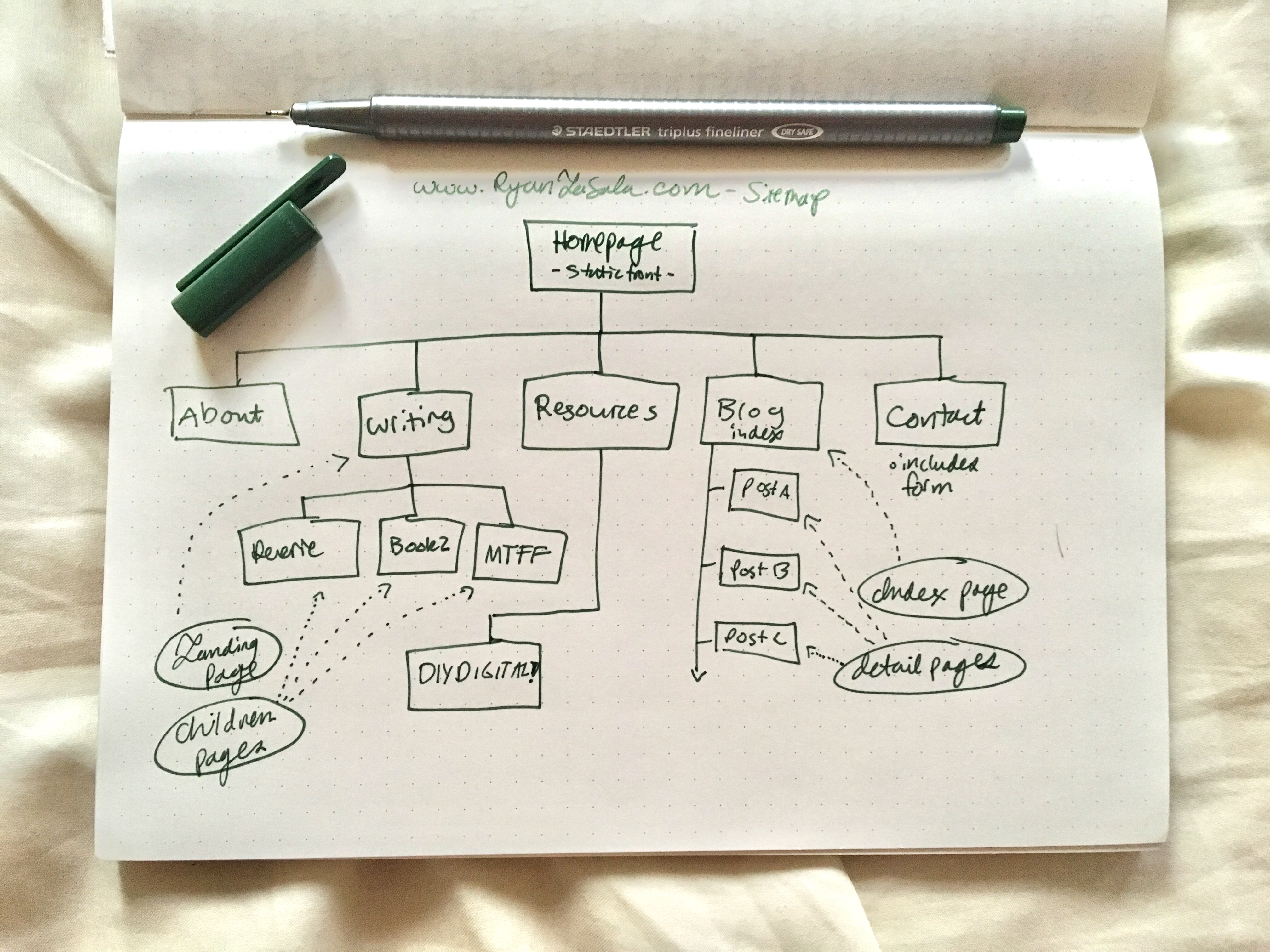
Your author site needs structure, and according to the ancient wisdom (me), it’s best to first messily draw this out on paper before creating a digital version. Most of my sitemaps start out looking like this:

SITEMAP OPTIONS
Here’s a breakdown of what you’ll want to use in your sitemap. Remember to only use what you need. Anything more, and your site’s navigation is going to get a bit confusing.
- HOMEPAGE – What do you want people to see first? Probably something COOL and IMPRESSIVE, right? Your homepage should NOT just be a list of blog posts (like on a standard tumblr). Instead, look for the option to create a static front page. On your homepage, I suggest including:
- A splashy, visually interesting hero image. More on that in an upcoming post.
- A CTA (call to action). What do you want your visitors to do? For me, I want people to check out my book on Goodreads, so my CTA asks them to do just that.
- Big News! Got something cool to announce? Or a new blog post you want to promote? Why not add it to your homepage?
- ABOUT – Should include the following:
- Author photo — find your friend with the nicest iPhone, turn it to portrait mode, wait for the sky to turn cloudy (best for portraits), and give that camera your best writerly glare. Eventually, you’ll want a high-res image for bookstores to use in promotional materials.
- Bio — this doesn’t have to be long. It just has to be accurate.
- Contact info — I like to give people a list of places on social media they can follow me if, for whatever reason, they’re not sick to death of me on Twitter and want more. Bizarre, I know. You can also insert your email (or a contact form), but I suggest creating a new page for that info (see below).
- Important Links — got a Patreon? A pet project? Link it here. About 8/10 people will go to your ABOUT page before any other page on your site, so it’s worth loading it up with what you want people to see.
- WRITING/BIBLIOGRAPHY – A summary view of your work, with links to those works. You can either list out all your work bibliographically, like http://brandonlgtaylor.com/writing, or you can do what I do: create a landing page for your Writing in general, and then create individual pages for those projects. I do this for one big reason: when my books are published, I want individual pages for each book with links to where someone can buy those books. Having a discrete URL will come in handy for posting on social media, too.
- PROJECT A – Example: REVERIE
- PROJECT B – Example: Moon Twilight Flash Fiction
- Notice that this is also a listing page. This is because the work exists on a tumblr, and my ultimate goal is to drive traffic TO that tumblr.
- BLOG (optional) – If you have a blog, you’ll want a page that compiles ALL your blog posts in chronological order. In WordPress, this is called an index page.
- BLOG A
- BLOG B
- BLOG C
- NEWS (optional) – Eventually you’ll want a place to compile all the news announcements about your writing! Things like interviews, guests blog posts, publication dates, cover reveals, etc. You can absolutely use your BLOG section for this, and create a NEWS category for these sorts of announcements like I do. This keeps upkeep simple n’ clean, but probably makes it harder for folks to find my most recent announcements. This is why I update my homepage with Big News.
- EVENTS (optional) — Eventually, when you are very famous and do not have to beg your 5 friends to come sit at your events, other people are going to need a place to find out where you’ll be and when. This will be your events page.
- CONTACT (optional) — Some people have a Contact page, and some people simply put a form on their ABOUT page. Whichever you go with, you need to include:
- Agent contact information
- General inquiry form (like I have here). The reason behind a form is that it doesn’t expose your email to bots that crawl the internet, looking for people to spam. You can of course just put your email up, but where’s the posh-ness in being so accessible? Use a form and feel cool, I say.
- FAQ (optional) — Whenever I see an FAQ on the site, I wonder if those questions are actually asked frequently, or if this person simply wants to pretend they so they can answer questions they wished were being asked. Either is fine! FAQs can be ornamental or essential. If you want to include one, ask yourself if you’d be better off inserting these answers in locations on your site where those questions are actually going to come up. For instance, if you FAQ is all about you….then why not add those answers into your ABOUT page? If your FAQ is all about your book…then why not add those answers into your BOOK page?
Questions?
Get in touch via the form on my Resources Page.
